20 Best Two Colour Combination for Bedroom Walls for 2024
15 Sep 2022, Read Time : 14 Min
20 Best Two Colour Combination for Bedroom Walls for 2024
Nothing is comparable to the feeling of decorating your bedroom – especially when you have just four plain walls staring back at you. You can create an ambience that can help you feel energised at the start of the day and help you unwind at the end of the day. The bedroom is your personal space and should be a reflection of your persona! What makes a bedroom perfect? Is it the furniture, the colours or something else together? While everyone has their own ideas regarding perfection, there are some basic factors that can help you create a perfect space to relax and rejuvenate in – one of them being the right colour pallet. It doesn’t matter if you are moving into a new bedroom or just want to give an old one a facelift – try opting for two colour combinations for bedroom walls instead of one and see the difference it makes! Most people prefer monochromatic pallets since they are safe, but an additional colour can help in adding more visual interest and can help create visual depth.
List Of Two Colour Combination for Bedroom Walls
Yes, it is easier to select a single colour and use it in varying shades in the space. It creates a cohesive look and you do not need to break your head over various combinations. But do not let the ease and simplicity of choosing a single colour keep you from opting for a dual-toned room. Using two colours can not only be fun, but can also give your bedroom a completely new look. Choosing two colours for your space is not the Herculean task you think it is – rather, it is very easy if you know the basics of the colour wheel. Utilise the power of colour to transform your bedroom! It’s as simple to transform your home as it is to comprehend the colour wheel. Find the ideal colour scheme for your bedroom to create a vibrant and engaging ambience. Visit your nearest tile showroomto explore various tile options. Here are the three basic principles to keep in mind:
Complimentary Colours
Complimentary colours are the colours that are on the opposite ends of the colour wheel. The most common complementary colour pairings are:
Green and Yellow
Blue and Orange
Yellow and Purple
Using complimentary colours can help you create a bright and vibrant space that is brimming with life.
Monochromatic Colour Choices
If you are unsure of using too many colours in your bedroom or just have a favourite colour that you just want to incorporate into your space, this look is for you. You can choose a shade that is darker or lighter than your selected shade to create a contrast. For example, if your chosen colour is blue you can opt for 3 bright walls and one sky blue accent wall for some contrast.
Neutral Colours
You can also opt to use a bright colour and a neutral colour to decorate your bedroom. Neutral colours are namely colours such as brown, grey, beige, black and white – colours that do not appear on the colour wheel. These colours work with almost all the colours and all you need to do is figure the right shade combination.
Best Two Colour Combinations For Bedrooms
If you have decided that you want to add some more colour to your bedroom walls, read on to know some of the best bedroom paint two colour combinations that you can opt for!
Blue and Grey
Blue and grey are the perfect combinations for a modern and uber-chic bedroom. It gives off a soothing vibe while exuding an aura of elegance. Blue is a soothing colour, while grey, being neutral, supports the colour and uplifts it.
Light Brown And Green
Green is a colour that exudes tranquillity, and when combined with brown, it helps create a relaxing environment. With a nature-inspired feel, this colour combination will evoke a feeling of serenity and calm in you.
Yellow and Cream
Yellow is often representative of all things happy – such as sunshine. While evoking happy feelings, a bright yellow can prove to be too much for a bedroom space if used by itself. Adding some cream tones can help tone down the brightness of yellow while still maintaining that happy feel. The combination of yellow and cream can help create a room that exudes happiness but still has a relaxing vibe to it.
Dark Grey and Light Grey
Going monochrome? You can never go wrong with shades of grey! The combination of various shades of grey lends the bedroom a modern and chic vibe. The different shades of grey are representative of a blank slate and can signal a new beginning.
Orange and White
Orange is a bright colour that can uplift the sourest of moods. It can be used in conjunction with white in the bedroom. From shades like bright tangerine to dusky burnt orange – you can use any shade in the bedroom that you would like. While using orange might feel a little intimidating, you can opt for softer or darker shades and use in combination with white so that the orange doesn’t take over the space completely. Here are the other orange two colour combination for bedroom walls you can explore.
Teal and Mink
Teal and mink might sound way too fancy, but in reality, it is simply a combination of a dark greenish blue shade (teal) with a soft brownish/greyish shade with undertones of pink or mauve (mink). In the bedroom, this combination can help create an ambience that is refreshing and helps in unwinding. This combination can be paired with all-white furniture for a modern and chic look.
Light Blue and Yellow
The combination of blue and yellow in a bedroom is all about infusing comforting and positive vibes into the space. An all-blue bedroom with a bright splash of yellow is a great way to make a statement while still keeping things toned down overall. This colour combination is ideal for those looking to add a fun element to their bedroom. If you love this colour combination but wish for a little toned-down or restful approach, you can use pastel shades of the colours.
Dark Blue and White
While selecting colours for a space the easiest way to go is to select a white and then jazz it up with another colour. Dark blue has a striking contrast against white and can be further spruced with wooden accents to complete the look.
Pink and Green
Pink and green is a combination often found in nature – which is why we find it very comforting when used in an interior setting. Think of pink flowers with green leaves or pink butterflies floating over green trees – evokes a feeling of serenity, doesn’t it? Green has a calming effect on the mind, while pink has a dreamy feel, and it is these emotive powers that make this combination a hit in the bedroom.
Charcoal and Mint
Charcoal is a great neutral and can serve as a backdrop for you to experiment upon. Mint is a soft shade of green that is neither too bright nor too eye-catching. This is why the combination of charcoal with mint is great for those who wish to induce some colour into their bedroom but are looking for a toned-down pallet.
Gray and Mellow Yellow
The juxtaposition between the brightness of yellow and neutral undertones can be a bit jarring but can help create a fun space for you. You can opt for three grey walls with a yellow wall or paint all your walls two-thirds of the way up grey, with the top part being yellow. Or opt to create a yellow and grey accent wall. The possibilities are endless!
Peach and White
Peach is an often preferred colour for bedrooms, thanks to the comforting effect it has on the mind. Combine the soft hue with some milky white walls to create a minimalistic décor scheme. Bright white accessories can complete the look and elevate the aesthetic of your bedroom.
Black Pitch and Grey
Black is often representative of simplicity, while grey exudes a mysterious elegance. Combine the two together, and you can create a space that is modern and sophisticated. While an overdose of black can darken a room and make it feel gloomy, when used sparingly in combination with grey, it can help create a space that is elegant and charming. Some leather and wooden elements can further enhance the beauty of the space and add a touch of glamour to it.
Indigo and White
Indigo is a deep shade of blue and is representative of strength and wonder. The colour works well in combination with bright white. Together, the combination has a soothing effect and can help create a relaxing environment. White accessories can further help elevate the look of the space.
Olive Green and Rusty Pink
Both colours have a sophisticated look and can make your space feel beautiful. A combination that is naturally occurring, olive green and rusty pink can be used on the walls to add a touch of class and elegance to your space.
Pale Blue and White
The combination of pale blue with white helps create an ambience that is calming and peaceful. You can go out of the norm, and instead of painting 3 walls blue (or white) and creating one accent wall, you can start from the bottom of the wall with pale blue and slowly lighten the colour until it’s white towards the ceiling.
Lavender and Off White
Lavender and Off White are an offbeat combination that has been gaining popularity in recent years. The combination of the two helps create a dreamy and tranquil space for you to relax in. You can opt for an out-of-the-box look by painting your walls off-white and ceiling lavender. This helps create a bedroom that exudes a joyful and restorative vibe – a need in this post-pandemic world.
Brown and Cream
Brown and Cream is a sensuous combination that is full of drama and is one of the most preferred colour combinations for the bedroom. The combination is classy and comforting and can exude a warm, inviting feel. Keep the walls mostly cream and add subtle touches of brown for maximum impact. Brown furniture and accessories and cream linens can further add to the beauty of the bedroom.
Burgundy and Beige
Burgundy is a dark reddish purple colour that exudes an old-world charm. While striking to look at, the colour can feel a little too dark for the bedroom. The colour, and the overall feel of the room, can be lightened and brightened by combining it with beige. The combination has an elegant and classy look and is reminiscent of an art deco-like feel. Burgundy is glamorous and can add a touch of drama and romance to any space that it is added to.
Colours that make a room look bigger and brighter
Colour has a great impact on the overall look of the space, and choosing the right colours can help you set the perfect mood for the space. Here are some colours that will help make a smaller room feel bigger and more open:
Dark Blue
Small rooms often require a wow factor to distract you from the tightness of the space, and a dark blue wall does just that. One dark wall, paired with three lighter walls, can have a bold impact on the look of the space.
Warm, Earthy Ochre
Small rooms often require a wow factor to distract you from the tightness of the space, and a dark blue wall does just that. One dark wall, paired with three lighter walls, can have a bold impact on the look of the space.
Off White
Off-white is a simple and clean colour that makes it extremely easy to work with. The soft colour makes the space seem much bigger, especially when used in contrast with vibrant colours and some well-placed plants.
Dark Grey
Dark grey has this modern, minimalistic feeling that most people love. It has a very clean and crisp look, making the room feel elegant and sophisticated. It also provides you with crisp edges that make the space feel tidier and bigger than it actually is.
Pale Blue
Pale blue is a soft colour that has the ability to invoke the feeling of openness and lightness, making the space feel open and lighter. The colour can be paired with other lighter colours, such as white and baby pink, to create a calming and relaxing space.
Sea Green
Sea green is a very gentle colour that evokes a minimalistic vibe. It pairs well with woodsy colours and can have a very soothing vibe in the space. It can freshen up the room and make it feel brighter, making a compact space seem bigger.
Light Green
Light green is a vibrant colour that pairs very well with neutral colours like white to create an open space. It can give a modern look to any space and can make the space feel calm and inviting.
Charcoal Black
If your room doesn’t have a source of natural light, black can help make a room feel more intimate. It can be used as a complementary colour to a lighter colour, such as light purple, light blue or light green and can make the room feel bigger and grander.
Taupe
Taupe is a dark brownish-grey colour that has a relaxing effect on the mood of a space. Since it is on the lighter end of the colour scheme, it can make the room feel a lot bigger than it actual
Choosing Paint Colours to Match Your Floor Tiles Based on Textures and Tones
Choosing a colour pallet that works well with existing tile flooring can be a little tricky. The walls and floors of your room need to complement each other or else the whole room will seem a little off-balanced. Here are some pointers you can keep in mind while choosing the paint colours for your room based on the tile flooring:
Find The Undertones That Work Well With Your Floor Tiles
Discovering and establishing the undertones of your existing flooring is one the main factors while determining the colours of your walls. Tiles with cooler undertones work best with cool colours like green or blue and might not work well with warmer colours like yellow. On the other hand, flooring that has warmer undertones works best with hues of yellow and soft neutrals. It is best to avoid shades that have a strong tan presence as they can pull down the mood of the whole space.
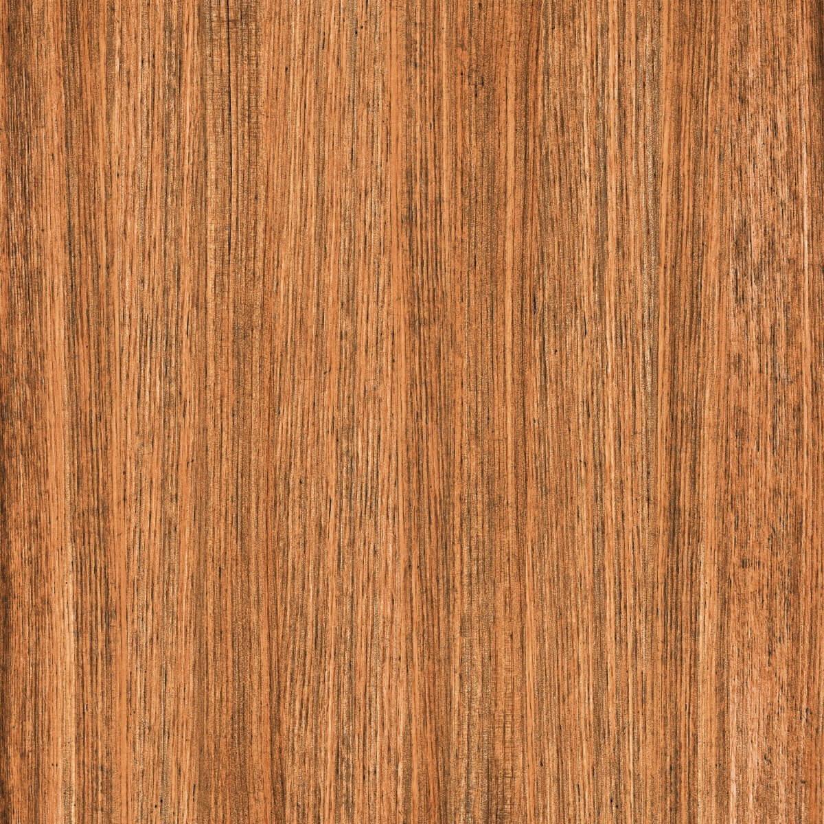
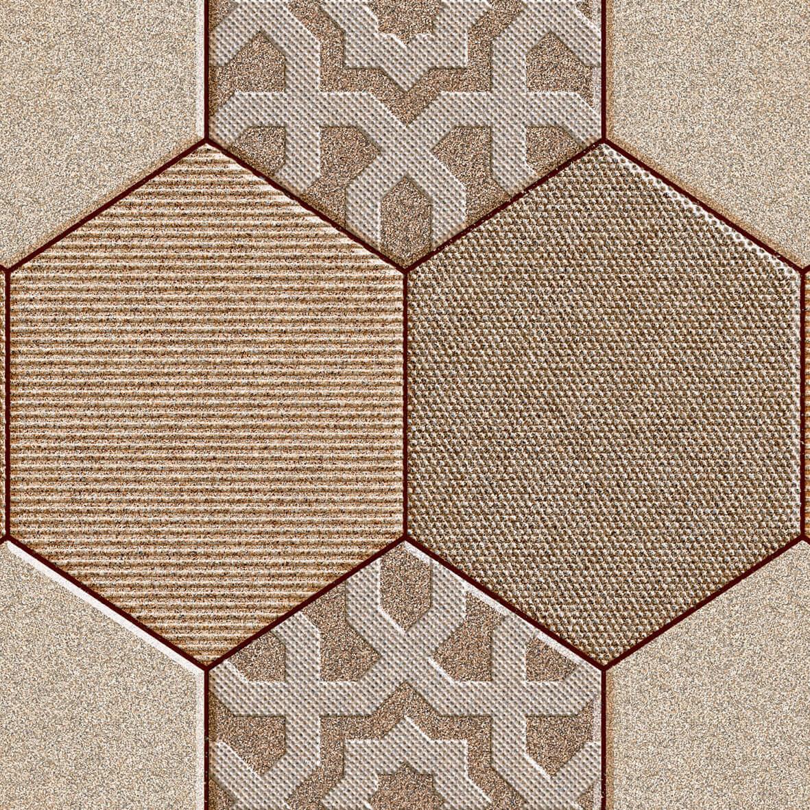
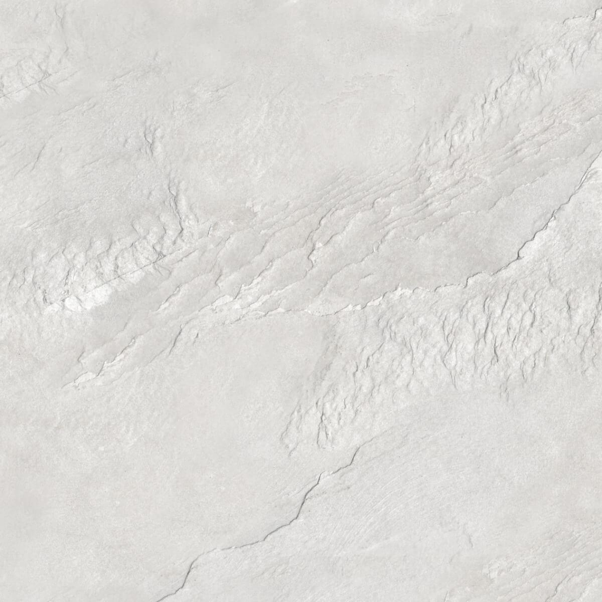
Keep In Mind The Texture Of The Tile
A lot of times, we tend to ignore the texture of the floor tiles while determining the wall colour. Natural stone look tiles pair best well with neutral colours, regardless of the colour of the tiles. Similarly, smooth and glossy tiles look best when paired with darker and dramatic shades.
Wall Colours to Complement Your Tile Colours
As mentioned before, choosing the right colours for your floors and walls can be a tricky process and if certain factors aren’t kept in mind, you will end up with a space that is a hot mess. Two more factors to consider while choosing the tiles for your bedroom are the size of the room and the colours of the walls, as both will have a great impact on the overall look of the space. Here are some fail space and bedroom and floor tile colour combinations:
Purple Walls With A Yellow Undertone Floor
As mentioned before, yellow and purple are complimentary colours on the colour wheel and the combination of these two colours works well in creating a space that is vibrant and happy. Here are other purple two colour combination for bedroom walls.
Go Rustic With Red Undertone Floors And Green Walls
While red and green often scream Christmas, the combination can be used in ways that work well year-round too. Floors with red undertones and dark and mossy green walls can have a rustic yet beautiful effect.
To give your room a spacious look, you can use the following tiles with almost any wall colour:
Choose the following tile colours:
White tiles
White is a neutral colour that works well with almost any colour – just make sure you match the undertones of the white with the shade of your choice. For example, off-white floor tiles pair beautifully with lavender walls, while bright white floor tiles look striking against navy blue walls.
Grey tiles
Grey is another neutral colour that pairs well with almost any colour. Grey and blue, grey and pink and grey and yellow are some of the classic combinations you can use in the bedroom.
Soft black tiles
While people don’t really prefer using black in bedrooms, it really is a colour that can add a touch of elegance and sophistication to your room. Since the floor will be darker, it is best to opt for lighter wall colours, such as white, beige or brown, to brighten the space.
Light neutral tiles
Neutral tiles, especially the lighter ones, work well with most colour pallets, subject to matching the undertones. Beige can be paired with pink, grey with a pale yellow, white with dark blue, and brown with a refreshing green – the possibilities are endless.
Pastel tiles
Pastel shades are known for being soft and pale colours, but pastel tiles have a great impact on the overall look of the space. Pastel floor tiles can be combined with a number of bright as well as neutral walls. For example, a baby blue floor tile may be used in conjunction with soft pink walls or a mint green floor tile may be paired with brown tiles for a serene look.
While you can use most colours in the bedroom, a study has shown that blue is the best colour to use in the bedroom for a good night’s sleep, followed closely by a tranquil green. Colours like pink, white, and beige can also help you feel relaxed and rejuvenated. On the other hand, large doses of red, purple, orange, brown and black, since they evoke energy and can make it difficult to relax. That said, you can still use the aforementioned colours in the bedroom in small doses and in muted shades – just don’t opt for bright tomato red walls, it will make sleeping difficult for you!
The best colour to improve sleep is the colour blue. It is the colour of the sky and the sea. It can also be linked to evoking a feeling of trust, dependability and stability. The colour also brings in a sense of safety, relaxation and calm in us – making it the best colour to improve the quality of sleep.
While you can have two accent walls, having more than one accent wall beats the purpose of having an accent wall. An accent wall is supposed to work as a “wow factor” in the space, and having more than one accent wall will diminish the effect it has on the space.
Blue is one of the most relaxing colours for a bedroom. It induces a sense of calmness and adds to the sense of safety you feel – a major plus in the bedroom where you are at your most vulnerable self. The colour is also linked to evoking feelings of stability, dependability and trust, making you feel relaxed and calm.
Mannika Mitra is an Arts Graduate from the Delhi University & a Post-Graduate Diploma holder in Journalism and Mass Communication. She has worked as a digital producer with new agency; ANI, NDTV & Hindustan Times before joining Orientbell Tiles as a part of their digital and content marketing team. Her interest in interior design and knowledge of tiles comes from her family of architects and Tile Shop owners. In her quest to write useful blogs that help users pick the right tiles and renovation inspiration, she frequently does research with architects, tile dealers among others. Apart from writing content for the website she loves to travel, know about various cultures and binge watch on OTT platforms.


 PGVT Calacatta Natura 600×1200 mm