The home’s front elevation is the first thing anyone notices, even before stepping inside. It sets the mood, gives a hint of your style, and reflects your personality. Choosing the perfect front elevation colour combination is all about finding the sweet spot between following the latest trend, durability, and an appeal that doesn’t fade with time. When you are picking elevation tiles for modern Indian homes, the challenge is to find colours that look elegant, withstand harsh weather, and still feel warm and welcoming. The right colour combination can create a striking elevation that’s eye-catching without being overwhelming.
Why Front Elevation Colours Really Matter
The exterior of your home does more than just give it a charming look. It shields your home from pollution, dust, heat, moisture and sustains extreme climatic conditions. Well-chosen house elevation colours can:
– Enhance architectural features – Give a small space an illusion of being bigger – Bump up your property’s value – Reduce frequent repainting and maintenance
This is the main reason why a lot of homeowners are now gravitating towards exterior tiles over paint. They offer long-lasting colour, texture, and weather resistance, and elevate the look of the home exterior. They can add a touch of ruggedness with stone tiles and a timeless appeal with wooden ones. The myriad options have what it takes to fit your idea of an aesthetic heaven for our home.
Trending Front Elevation Colour Combinations for Indian Homes
Let’s explore some of the front elevation colour combinations that are not only stylish but also work beautifully across Indian cities and climates.
1. White and Grey – Clean, Modern, Timeless
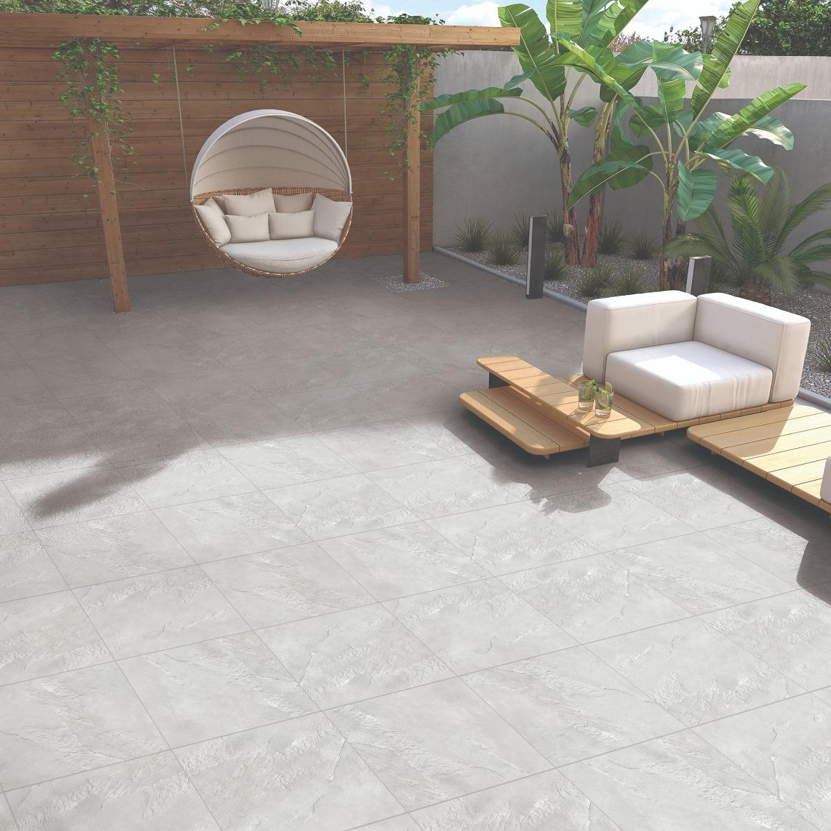
You really can’t go wrong with this pair, as it never goes out of style. White keeps things bright and airy, while grey adds a sharp, modern edge. It’s perfect for homes with straight lines and a simple, contemporary style. Use textured grey tiles on vertical sections and smooth white tiles for the main walls. The mix adds visual depth and keeps your exterior from looking bland. The striking EHG 3D Block Diamond Slate is a stunning example of how impactful white and grey can be together. EHM Cliffstone White and EHM Cliffstone Grey are perfect examples of modern elevation tiles.
2. Beige and Brown – Warm and Earthy
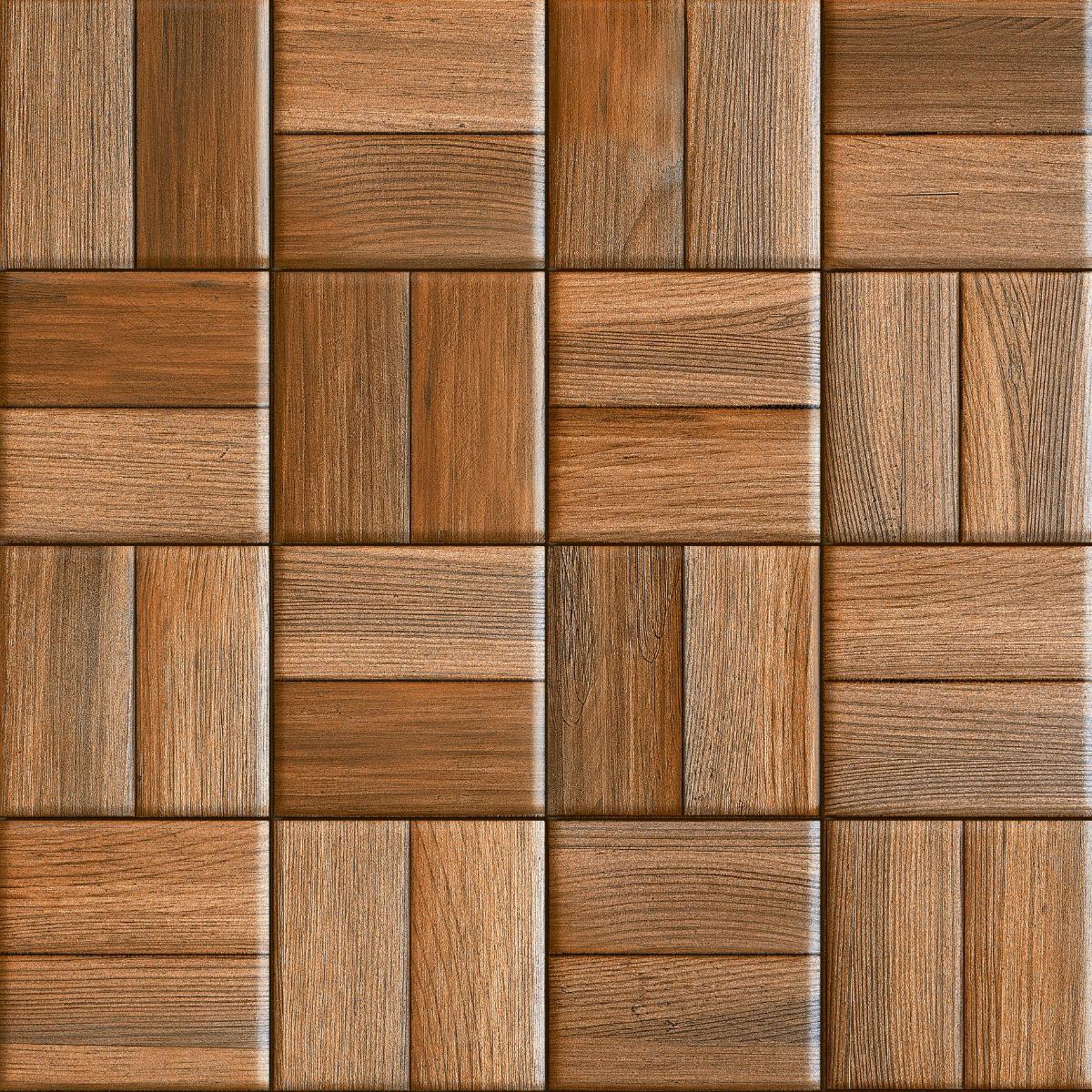
If you are looking for something subtle yet classy and rich, then a beige and brown colour combination for house elevation is the best bet. The adaptable flexi tiles are a beautiful choice for the curved walls and unconventional designs. They wrap-around pillars and curved edges, as they are completely flexible. Moreover, they offer shades that blend well with natural surroundings and are ideal for independent homes and villas. Opt for stone-finish or wood-finish tiles to add warmth and a rustic look to your exterior without the hassle of maintenance. The Mushroom Sunrise Arch Flexi and Camel Sunrise Arch Flexi are great examples of earthy and war toned flexi tiles. Mushroom Stream Limestone Flexi and Camel Stream Limestone Flexi offer the same shades but a different feel of elevation.
3. Grey and Yellow – A Modern Twist
For homeowners who love to experiment with bold house elevation colors, pairing soft yellow with grey is the way to go. This colour combination gives an exquisite look, and this pair looks great on duplex homes and modern row houses. The grey forms a neutral base, and yellow can be used as an accent to give the home exterior an exciting twist. It’s important to use yellow in moderation, as overdoing it can make the exterior look overly loud or gaudy. Craftclad Mosaic 4X8 Beige brings together multiple shades, highlighting the power of yellow and grey together. Other options are Mandala Universal Grunge Multi and Mandala Universal Rustic Multi.
4. Brick Red and Warm Cream – Rooted in Tradition Yet Stylish
Brick red has a strong Indian architectural connection; it feels rooted, warm, and timeless. The soft cream provides the perfect balance and keeps the elevation elegant. This timeless combination is ideal for all sorts of homes and villas. To achieve a classic and enduring look, use brick-red textured or brick-look tiles as a feature wall or vertical panel, while keeping the rest of the façade in soft cream. OEG Indus Brown is a striking mix of this combination. Another alluring combination would be Terra Sunrise Arch Flexi and Bianco Sunrise Arch Flexi.
5. Cream and Coffee – Elegant and Balanced
This is a popular front elevation colour combination in urban areas. The coffee colour adds a pinch of drama while the cream keeps the elevation light and spacious. Adding tile cladding around balconies or entrance columns enhances the overall appearance. Try the Mandala Universal Grunge Brown, or a combination of Mandala Universal Rustic Beige and Mandala Universal Rustic Jungi.
6. Teal Blue and Soft Beige
Looking for a modern alternative to your regular blue? Then teal blue it is! Teal brings a refreshing sense of vibrancy to the elevation without making it look overwhelming. Pair this with the soft beige colour, and you have a combination that is sophisticated, bright, and aesthetically pleasing. This front elevation colour combination works beautifully for modern duplexes and corner homes that need to stand out subtly. For a refined, designer finish, use teal sparingly on columns, balcony recesses, or as a vertical tile strip to enhance the architecture without dominating the façade. A mesmerising combination of Sky Gloss Fresco Subway and Creama Gloss Fresco Subway can make your front elevation picture perfect.
White and beige stone make a simple yet sophisticated front elevation colour combination for Indian homes. White keeps the façade bright and spacious, while beige stone-look tiles add warmth, texture, and visual depth. This combination works particularly well for large independent homes and villas with balconies, pillars, and multiple levels. Use beige tiles on vertical sections, pillars, or the entrance wall while keeping the rest of the façade white for a balanced appearance. HLP Level Nebula Beige paired with EHM Cliffstone White can help recreate this elegant and timeless look.
8. Lavender and White – Soft and Distinctive
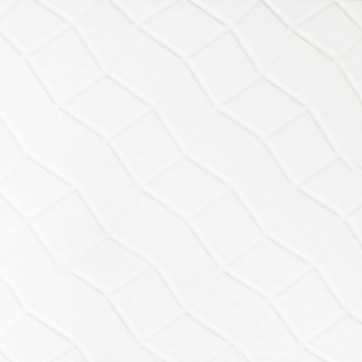
Lavender and white create a soft yet distinctive front elevation colour combination for homeowners looking for something different from traditional neutral shades. Lavender adds a gentle pop of colour to the façade, while white trims, pillars, windows, and borders keep the exterior looking bright and balanced. For a more textured look, use lavender as the main exterior colour and introduce EHM Brick White on selected pillars, borders, or feature sections. This creates contrast while keeping the façade visually balanced.
9. Rusty Orange and Grey – A Punch of Colour
Rusty orange and grey make a striking front elevation colour combination for homeowners who want to add a punch of colour without making the exterior look too bright. Grey provides a balanced and contemporary base, while rusty orange can be used on pillars, borders, window frames, or selected sections of the façade to create visual interest. This combination works particularly well with modern homes featuring clean lines and simple architectural details. For a textured elevation, pair SEG Brick Grey with a warm terracotta-toned option such as HEM Hewn Rustic Cotto to create an attractive contrast between cool grey and earthy orange tones.
10. Blue and White – Calm and Serene
Blue and white make a refreshing front elevation colour combination that works well for both modern and traditional Indian homes. Blue adds depth and character to the façade, while white keeps the exterior bright and balanced. Use blue on selected walls, pillars, balcony sections, or vertical strips and pair it with white on the main walls and trims. For added texture, Craftclad Linear Stone Blue can be used on feature sections along with white tiles such as EHM Cliffstone White. For smaller accent areas, Navy Blue Matte Sandy Subway can also add a rich touch of blue to the elevation.
11. Mustard Yellow and Brown – Bright Meets Earthy
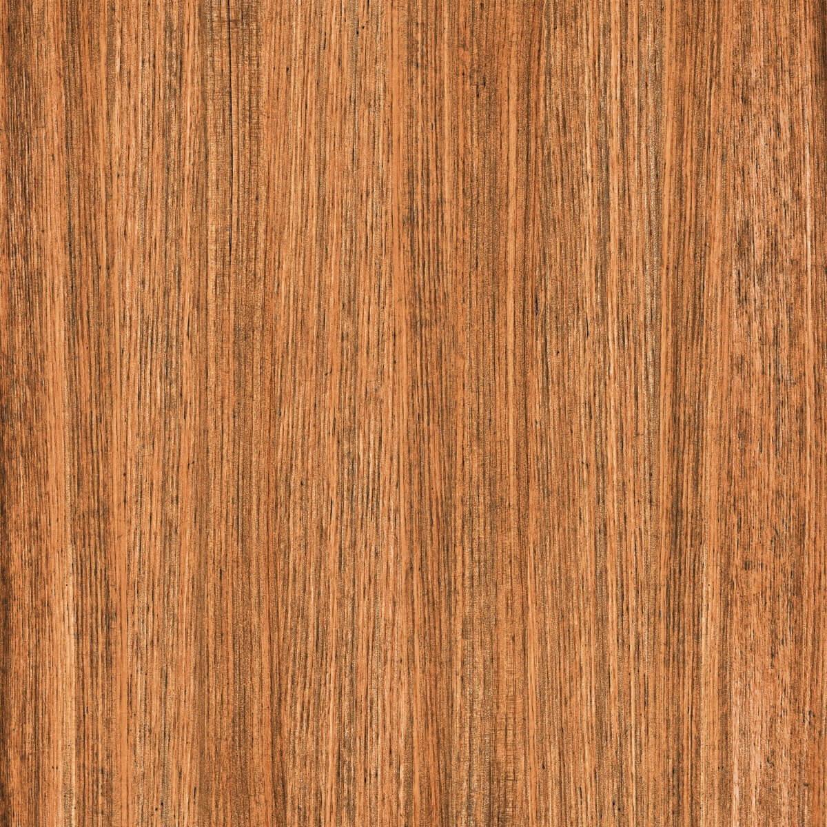
Mustard yellow and brown create a warm and welcoming front elevation colour combination with a natural, earthy feel. Use yellow as an accent colour on a feature wall, balcony section, or selected architectural elements to add a bright touch to the façade. Dark brown, wood-look tiles can be used on pillars, entrance walls, or other sections to add depth and texture. This combination works especially well for independent homes with balconies, sloping roofs, and wooden-style details. Plain Mango Yellow can be used to create a bright accent, while DR DGVT Hickory Wood Brown adds a rich, dark wood-like finish to balance the yellow.
12. Dark Green and Beige – Natural and Sophisticated
Dark green and beige bring a natural, grounded feel to the front elevation. Beige keeps the exterior light, while dark green adds contrast and gives the home a distinctive appearance. This combination works especially well for homes surrounded by plants or gardens. Use dark green on a feature wall, balcony section, or entrance area rather than covering the entire façade. HLP Level Nebula Beige works well as a textured complement to the green.
13. Charcoal and White – Bold Contrast
Charcoal and white create a bold yet balanced front elevation colour combination for modern homes. The deep charcoal tone adds depth and character, while white keeps the overall exterior light and spacious. Use the darker shade on a feature wall or selected sections of the façade and balance it with white on the surrounding walls. Ash Fine Line Flexi brings a rich charcoal-grey tone with a subtle linear texture, making it a good choice for creating a statement section against a white exterior. Its matte finish adds depth without making the elevation look too heavy.
14. Peach and Beige – Soft and Warm
Peach and beige create a soft and welcoming front elevation colour combination that works well for both traditional and contemporary Indian homes. Use beige as the main exterior colour to create a warm neutral base, while peach can be introduced on feature walls, pillars, balcony sections, or around the entrance for a subtle pop of colour. Peach Matte Cloudy Subway can be used on selected elevation sections to bring in a soft peach tone, while beige walls or neutral stone-look tiles can balance the overall look. The combination adds warmth and character without making the façade appear too bright or overwhelming.
15. Multi-Tone Stone and White – Natural Appeal
Multi-tone stone and white create a balanced front elevation colour combination that brings natural texture and character to the exterior. The varied earthy shades of the stone-look tiles add depth to selected sections of the façade, while white keeps the overall elevation bright and clean. Use the multi-tone tiles on feature walls, pillars, entrance areas, or balcony sections to create a focal point without covering the entire façade. EHM Cliffstone Multi is a suitable choice for adding a natural stone-like finish and can be paired with a white exterior for a balanced and welcoming look.
Front Elevation Colour Combinations: Quick Comparison
Explore these popular front elevation colour combinations to find a look that suits your home and style.
Colour Combination
Suitable Home Style
Recommended Tile Finish
White & Grey
Modern homes, contemporary builds, straight-line elevations
Textured grey + smooth white matte
Beige & Brown
Independent homes, villas, curved or unconventional facades
Stone-finish or wood-finish
Grey & Yellow
Duplexes, modern row houses, contemporary homes
Matte grey base + bright yellow accent
Brick Red & Warm Cream
Tradition
al homes, villas, Indian-style elevations
Brick-look textured + smooth cream
Cream & Coffee
Urban homes, villas, apartment-style elevations
Brown textured + smooth cream
Teal Blue & Soft Beige
Modern duplexes, corner homes, contemporary elevations
Glossy teal + soft beige
White & Beige Stone
Large independent homes, villas, multi-level elevations
Modern homes, contemporary villas, bold elevations
Linear textured charcoal-grey + clean white
Peach & Beige
Traditional and contemporary homes, warm-toned facades
Matte peach + neutral beige
Multi-Tone Stone & White
Villas, large independent homes, statement entrances
Multi-tone stone-look + smooth white
How to Choose the Right Colour Combination for Your Home
Keep the following practical factors in mind before you finalise the color combination for house elevation:
Climatic Conditions: If you live in a region that is mostly hot, then lighter shades are a good choice as they reflect light and keep your interiors cool. Homes in coastal areas where humidity is common, tiles are a smarter choice than paint due to moisture resistance.
Home Size and Structure: This is a crucial factor to keep in mind while choosing the front elevation colour. If you have a small, cosy home, then choose a lighter shade of colour to make it look airy and open; dark exterior colours can make the home look cramped even from the outside. Darker tones are well-suited to add drama to bigger elevations. Use contrast wisely to highlight architectural features like balconies and windows.
Surroundings and Neighbourhood: Choose colours that complement nearby buildings while standing out with its own unique style.
Vastu Direction: If Vastu is an important consideration, choose colours according to the direction of the front elevation. Light shades such as white, cream, light blue, or green are generally preferred for north- and east-facing homes, while warmer shades such as yellow, beige, or earthy tones can work well for south- and west-facing elevations. Keep the overall palette balanced rather than relying on one colour alone.
Doors and Windows: Your front elevation colours should complement the colour and material of your doors and window frames. For example, white or beige walls pair well with dark brown wooden finishes, while grey and white exteriors can be complemented by black or charcoal window frames. Use these elements to create a cohesive look rather than treating them as separate features.
Architectural Features: Use colour and tiles to highlight the best features of your home, such as balconies, pillars, entrance walls, arches, or projections. A darker or textured tile can draw attention to a specific section, while lighter colours can make other areas recede visually.
Paint and Tile Coordination: If you are combining exterior paint with elevation tiles, make sure the shades complement rather than compete with each other. Use one colour as the dominant shade and introduce the second through tiles, accent walls, pillars, or smaller architectural sections for a balanced elevation.
Maintenance and Longevity: Consider how easily the chosen colours and finishes will show dust, stains, and weathering. Very light shades may require more frequent cleaning, while textured or darker surfaces can help disguise minor marks. Choose durable exterior tiles for areas that are exposed to rain, dust, and direct sunlight.
Paint fades and peels over a period of time and requires regular touch-ups, while exterior tiles offer long-lasting colour, superior weather resistance, and minimal maintenance, making them ideal for Indian conditions.
Orient Bell Tiles understands Indian homes, lifestyles, and climates. Our exterior tile collections are crafted to combine beauty with performance to ensure that your home exterior continues to look stunning year after year.
White and grey, beige and brown, and cream and coffee are versatile choices for a house elevation. For a more distinctive look, combinations such as teal blue and soft beige or rusty orange and grey can add colour without overwhelming the façade. Choose shades that complement your home's size, architecture, surroundings, and existing features.
Neutral shades such as white, beige, cream, grey, and brown continue to be popular for Indian homes in 2026. Homeowners are also using teal, blue, mustard yellow, rusty orange, and dark green as accent colours. Textured elevation tiles are increasingly being paired with paint to add depth and visual interest.
Light colours such as white, cream, beige, and soft grey are generally better for small homes as they make the elevation appear brighter and more spacious. You can introduce a darker colour or textured tile on a single feature wall, pillar, or entrance section to add character without making the exterior look heavy.
Tiles can be a durable and practical choice for house elevations. They are resistant to moisture, stains, and everyday wear, while offering a wide range of colours, textures, patterns, and finishes. Elevation tiles also add depth and character to the exterior and generally require less frequent maintenance than painted surfaces.
White and grey are a versatile two-colour combination for modern homes, while beige and brown create a warmer look. For something more colourful, blue and white, mustard yellow and brown, or rusty orange and grey can work well. The best combination depends on your home's architecture, size, surroundings, and personal style.
According to Vastu principles, light shades such as white, cream, light blue, and green are generally preferred for north- and east-facing homes, while warmer shades such as yellow, beige, and earthy tones are often recommended for south- and west-facing homes. However, colour selection should also consider the home's architecture, climate, and overall exterior design.
Prerna Sharma boasts 12 years of comprehensive experience in content creation and marketing strategies. For the past two years, she has served as the Content Website Editor at Orientbell Tiles, where she has been instrumental in shaping engaging online narratives. Prerna's expertise has been honed through impactful roles at CyberMedia, HT Media, and NIIT University. She holds an MBA in International Business from Amity International Business School and a Bachelor of Business Administration from Asia Pacific Institute of Management.


 600×1200 mm


 The home’s front elevation is the first thing anyone notices, even before stepping inside. It sets the mood, gives a hint of your style, and reflects your personality. Choosing the perfect front elevation colour combination is all about finding the sweet spot between following the latest trend, durability, and an appeal that doesn’t fade with time. When you are picking