For many homeowners, choosing the right kitchen tile colours becomes harder than they expected. Although the search starts as a simple design quest, it eventually becomes an intense decision-making exercise.
Questions like ‘will the shade make the kitchen look smaller or more expansive,’ and ‘will it handle the daily cooking mess?’ become prominent. Several homeowners also prioritise Vastu in this decision-making process because they want their kitchen to feel balanced and comfortable.
Hence, this blog lists the top kitchen tile colours as per Vastu so you can pick the right shades. We’ve covered the right tile colours for both kitchen walls and floors, so ensure you read the full blog.
Right Colours for Kitchen Wall Tiles as Per Vastu
Kitchen wall tiles are the first thing you’ll notice when you enter, so the colour needs to set the right mood. Since a kitchen carries the energy of fire (Agni), Vastu encourages shades that feel warm, lively, and positive.
Hence, you must explore the following shades for kitchen wall tiles, as per Vastu.
Yellow and Soft Mustard Shades
Anyone desiring a cheerful and welcoming kitchen must consider yellow and soft mustard shades. Vastu links it with nourishment and clarity, so they naturally align with cooking spaces. They even brighten the space without making the space feel sharp. If you’re ready to proceed with this shade, consider pairing it with wood, beige, or white elements to make it a practical, long-term choice.
Some more recommended kitchen tile colours according to Vastu are neutrals such as cream, beige, and warm off-white. These are some of the safest choices for homeowners who prefer something timeless.
According to Vastu, these colours are balancing shades. They keep the kitchen’s fire element steady rather than amplifying it. In everyday life, these shades offer simple advantages. They never feel dated, and they hide minor stains better than other light shades.
Since they’re versatile, they even blend well with a wide-ranging collection of cabinetry and countertop materials.
Light Green and Pista Tones
Light green brings a sense of freshness that suits kitchens beautifully. In Vastu, green represents growth and harmony, so this shade can instantly make your kitchen feel more relaxed.
These softer greens work well in kitchens with both modern modular setups and slightly traditional interiors. They also create a soothing visual contrast against stainless-steel appliances, keeping the space from looking too cold or metallic. To make your kitchen look bright, balanced, and welcoming, Orientbell’s Pista Green Gloss SandySubway tiles are a great choice. Their glossy finish reflects light well, making smaller kitchens feel more open, while the soft green tone adds warmth without overwhelming the space.
Soft Peach and Pastel Orange
Orange has a naturally warm and appetising feel, but Vastu encourages homeowners to choose lighter, gentler versions of it. Soft peach or pastel orange kitchen wall tiles can make the space feel friendly and energetic without becoming overwhelming.
These shades work well in both open-layout homes and compact kitchens, where warmth is needed but bold colours might feel too heavy. You can browse our latest kitchen tile collection to find beautiful tiles featuring these shades.
Floor tiles determine how grounded and stable a kitchen feels, which is why Vastu favours specific colours that can make it feel calm, supportive, and easy on the eyes. Since flooring demands more resilience than wall tiles, the shades you choose must feel balanced while being practical for daily life. You can check the following kitchen floor tile colours as per Vastu.
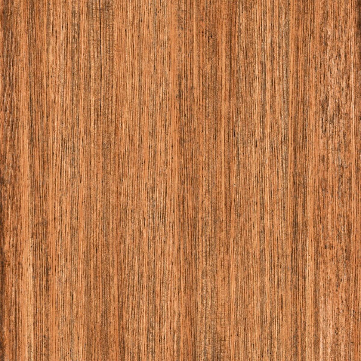
Brown and Earthy Shades
According to Vastu, earthy tones hold natural warmth that complements the kitchen’s fire element without competing with it. Light brown floor tiles create a steady and grounded look. They even work well in homes with busy kitchens.
If you’re concerned about maintenance, they emerge as the best option. You can rely on these shades as they hide dust, spills, and stains better than many lighter shades. Overall, they’re a really dependable choice.
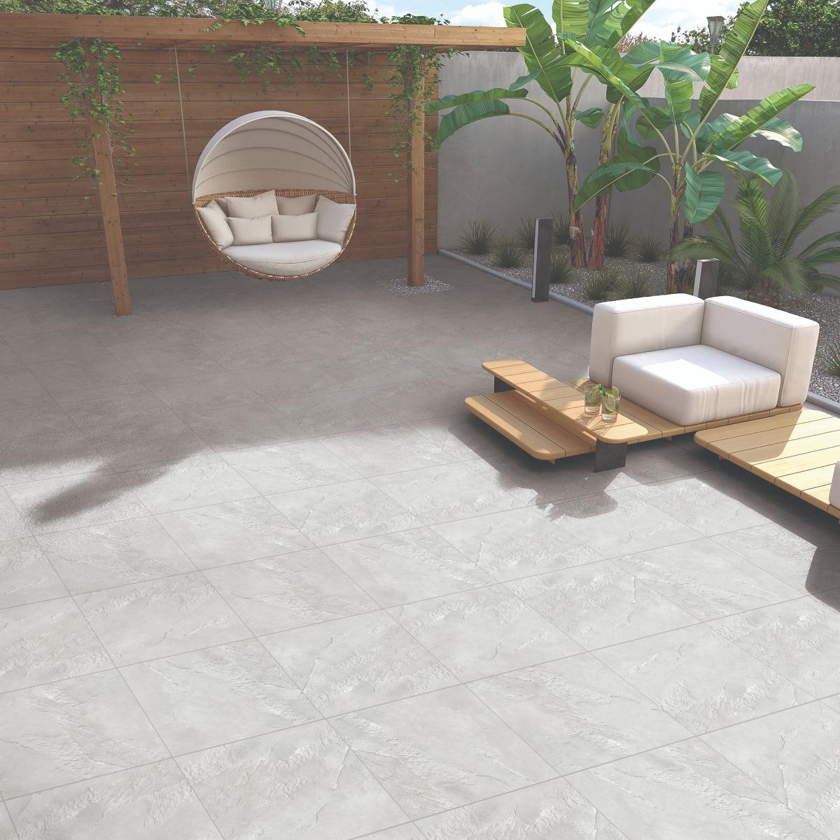
Beige and Sand Tones
Another excellent kitchen tile colour, as per Vastu, is beige and sand tones. Beige floors offer a clean, neutral base that fits into almost any kitchen design. Vastu views these tones positively because they encourage stability and harmony.
Many homeowners appreciate these shades because they go with almost everything. Also, beige helps smaller kitchens feel more open and less confined, especially when paired with soft lighting.
Although very dark greys can feel heavy in a kitchen, lighter grey tones work well in modern kitchen spaces. You should particularly explore kitchen floor tiles featuring light grey tones with warm undertones. They don’t conflict with Vastu principles when used thoughtfully.
They also provide excellent day-to-day practicality. Light grey tiles featuring warm undertones resist stains. These tiles add a subtle modern touch without overpowering the space.
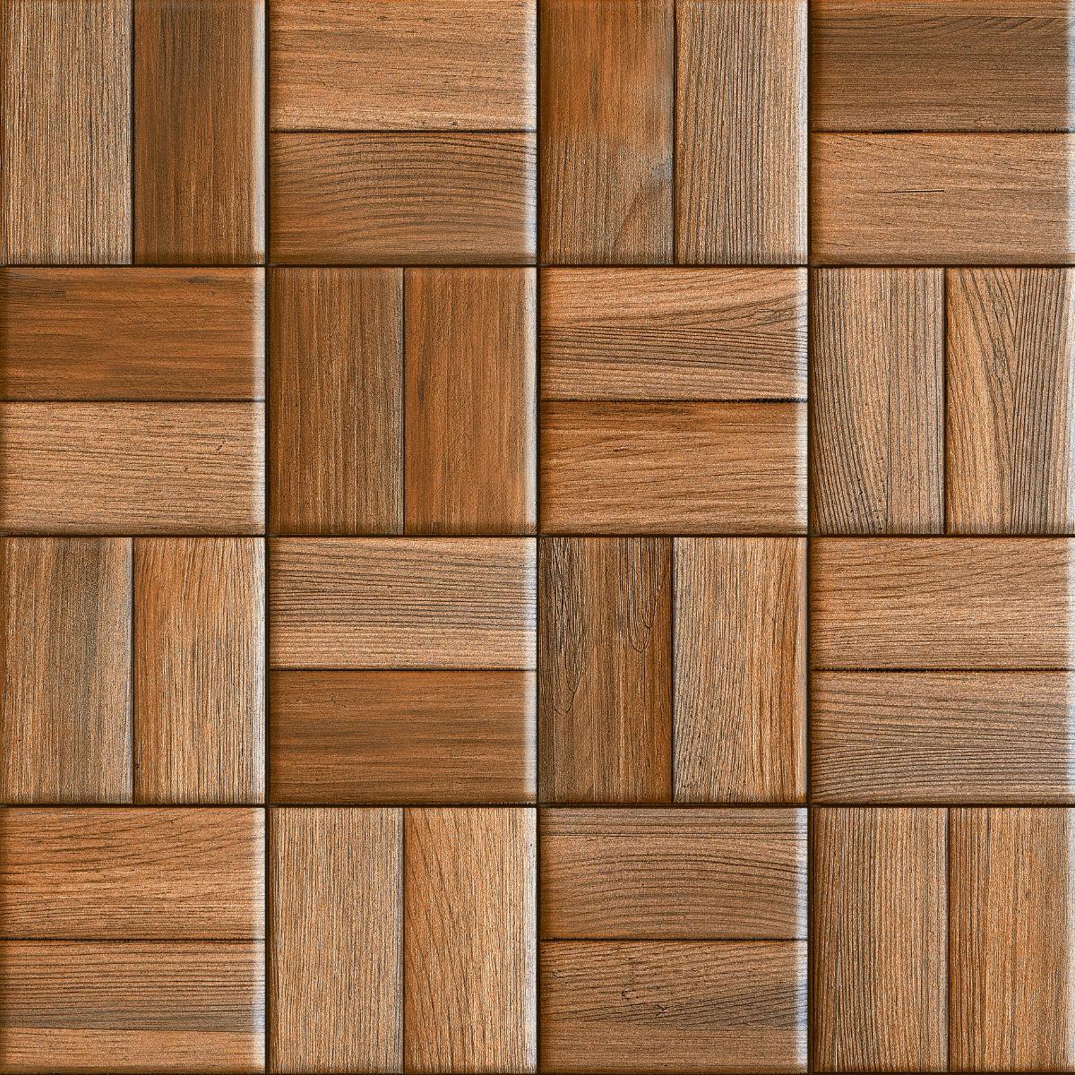
Muted Terracotta and Soft Red-Brown Shades
Terracotta-inspired hues offer a blend of earthy stability and warmth that looks well in Vastu-guided kitchens. If you keep them muted and soft, they can subtly add character into your kitchen without overwhelming the existing design.
These tiles work particularly well in homes that incorporate natural materials, handcrafted finishes, and slightly traditional design elements. Our Clay Sorrento Rustic Carving tile is an excellent option for your kitchen floors, as per Vastu, thanks to its red-brown shade.
Conclusion
Choosing a kitchen tile colour according to Vastu isn’t about strict rules. It’s more about creating a kitchen that feels balanced, comfortable, and easy to use every single day. Wall tiles should bring a gentle warmth and clarity, while floor tiles should make the space feel steady and grounded.
When tile colours balance energy and practicality, the kitchen becomes a space where cooking feels smoother and time spent feels more enjoyable. If you want Vastu-approved tile shades for your kitchen’s walls and flooring, then pick any shade listed in this blog.
You can find all the tiles at Orientbell Tiles, so ensure you check out the latest collection for high-quality, Vastu-approved tiles.
Prerna Sharma boasts 12 years of comprehensive experience in content creation and marketing strategies. For the past two years, she has served as the Content Website Editor at Orientbell Tiles, where she has been instrumental in shaping engaging online narratives. Prerna's expertise has been honed through impactful roles at CyberMedia, HT Media, and NIIT University. She holds an MBA in International Business from Amity International Business School and a Bachelor of Business Administration from Asia Pacific Institute of Management.


 600×1200 mm


 For many homeowners, choosing the right